 Black
& White, Love Black
& White, LoveThis
is a great example of contrast from hell, technically speaking,
of course. Artistically speaking, it's exactly this great
contrast which makes the photo so interesting!
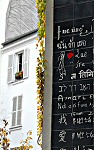
The pic is of the 'I Love You' wall in Montmartre which you've
probably seen here before where there's a flipping great black
wall covered in 'I love you' written in white in about a hundred
languages. I'm pleased with this, though, because I was
wondering on one of my photo tours how on earth to take an
original shot of this oft-visited edifice! And then I found it -
marvellous!
It's a wonderful marriage of scratchy black lines (the gaps
between the shutters) on a pure white building right next to
scratcy white lines (the 'I-love-you's) on a pure black wall.
Yikes! A real challenge to get the exposure right but not one
you should shy away from.
What you're aiming for is detail in the highlights and in the
shadows. In normal English, this means that you mustn't
completely white-out the building or black-out the wall so that
you've got something to play with later. My advice for digi-users
is simply take a lot of shots, checking the image after each
shot to see if it looks ok.
For non-digi-users it's more difficult. The potential for under
or over exposure is great, unless by some luck the camera's
meters are 50% influenced by the white and 50% by the black and
it all evens out! One of the simplest ways is to set your
exposure by pointing the camera at something mid-way between
black and white, such as grass, light grey concrete or even your
hand (but only if you're a reasonably tanned whitey, or pretty
pale darkie... good grief, this is complicated, isn't it?!).
In the end I managed to expose it pretty well on this shot in
any case, and contented myself with playing around a bit with a
couple of tricks on the computer to arrive at what you see here.
I love changing the photo over all if it doesn't make it look
too artificial, but I'm not keen on separating parts of photos
and processing them separately. That moves just over to the
wrong side of nerdy as far as I'm concerned and I reckon you
might as well have taken two separate photos and stuck them
together if you want to do that. But that's just my opinion and
if you like fiddling to that extent, have fun!
Finally, composition-wise, I decided to cut the photo exactly
down the middle with this thickish band of grey to create what I
hope is a striking image. No 'rule of thirds' for this shot,
folks (unless you count the dash of red)! Here I wanted to
achieve a sort of mirror effect, where the mirror represented by
the grey strip of wall converts black to white and vice versa.
~
November 2007 - Slide Show ~ |