![]()
|
FREE On-Line Digital Photography Course
One of the wonders of modern technology is the fact that we can snap snap snap and it costs us nothing more than the effort of pressing the shutter button... ... and the time taken to transfer the photos, and the anguish of deciding which one of ten variations on a theme is the best, and the ridiculous amount of disc space taken up by never-looked-at but never-erased photos, and the interminable slide shows friends have to sit through because you couldn't bring yourself to 'prune'. Almost makes you pine for the good old days when every click cost, doesn't it?!
Key points
First of all, decide
yourselves which picture you prefer: Witch 1,
Witch 2 or Witch 3. Now read on...
Exposure
At first glance, these
three pics all seem to be reasonably well exposed. But if
you look closely there are differences.
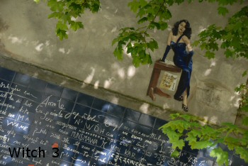 Pics
1 and 2 are slightly lighter than pic 3. This is because I
had bumped up the exposure by a stop or so beforehand and
forgot about it for the first two shots! It happens all the
time - watch out for that! You do this by pressing the
excellent exposure compensation (+/-) button and changing it
to +1 or whatever you want. If you don't have this button
it's probably in a menu somewhere. Pics
1 and 2 are slightly lighter than pic 3. This is because I
had bumped up the exposure by a stop or so beforehand and
forgot about it for the first two shots! It happens all the
time - watch out for that! You do this by pressing the
excellent exposure compensation (+/-) button and changing it
to +1 or whatever you want. If you don't have this button
it's probably in a menu somewhere.
After shot 2 I realised
that they were a bit light, so put it back to normal and
shot again, the result being that shot three is slightly
darker. Let's look at the result of the camera's choice of
exposure (shot 3) as opposed to the first two shots
(compensation of +1).
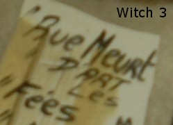
Although the colours in
shot 3 look slightly richer (because they are darker they
seem more saturated), look what's happened to the detail in
the darker parts of the dress.


We've lost a lot of the
folds of the dress across the breasts, in the strap and in
the arm, which are important details, both for the photo
itself, and to do justice to the original artist.
Curiously, the detail
in the green leaves seems to actually be better in pic 3!
But don't be fooled. This is due to another inherent
problem: sharpness/blur linked to point of focus (see next
section) and not underexposure.
Sharpness
A very interesting thing has happened here. Look back at the
last two pics from the exposure section and at the two pics
below.
At first I thought, oh,
there was a bit of camera shake on pic 3. But when I looked
more closely, it wasn't camera shake that caused the woman
and the writing to be blurred in pic 3. It was the point of
focus!
Of course I looked
first at the woman and the writing and came to that
conclusion. But now look at the leaves from pics 2 and 3:

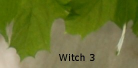
What's happened is that
in pic 3 I got the point of focus wrong and the leaves were
(relatively) sharp and the woman fuzzy.
And which is more
important to have in focus: a beautifully detailed painting,
including sharp text, and a wall full of writing ('I love
you' in over 100 languages!), or a bunch of swaying leaves?
That's right: the wall!
The problem with
focusing could have been helped if I'd chosen spot focusing
to make my task easier, but that's another lesson.
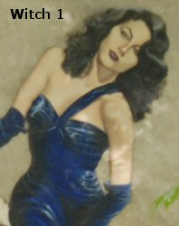
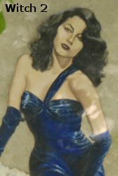
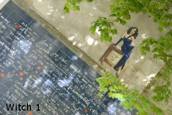
Composition So, after all that technical stuff, let's get back to more emotional issues, and also ask the question: What about Witch 1?! On the face of it pic 1 seems to be pretty similar to pic 2. In fact the exposure is the same, but in pic one again I messed up the point of focus - it's the leaves that are sharp - oops! But there is one far more striking and vital difference: the composition. Although in all three shots the woman is beautifully frames by the leaves (don't you think ? ;-) in the first pic, the angle of the important horizontal line is much sharper, nearing 45˚, whereas it is gentler in shots 2 and 3, closer to 30˚.
When a picture includes human elements, it's important to bear in mind what is physically and logically possible. It's less probable that the woman in pic 1 could be nonchalantly leaning against a table whilst standing on a 45˚ slope than in the other two pics. Also, the line in pic 1 slams violently down from the top to the bottom of the shot, making me think of a precipitous mountain slope and introducing a tension to the shot which doesn't match well with the lady's languorous demeanour. In shots 2 and 3 the line goes from side to side, much more calming and appropriate, adding to the sultriness of the image. Finally, in pic 1, the lady's neck must be killing her, and the lines of her left arm and from her waist to right breast are totally vertical, which is not nearly as visually pleasing as the sexy angles in pics 2 and 3, where she's seductively gazing over her left shoulder, as opposed to using it as a support as in pic 1! (Almost forgot, the woman's slightly smaller in pic 1, yet another reason to throw it out!) And the winner is... Wall Witch 2!
Photo Ideas
Summary
~ Comment on this lesson in the Photo Blog ~
This lesson belongs to the following sections... ~ under development ~ |
 "Which
Witch?"
"Which
Witch?"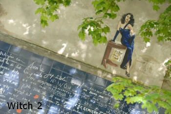 So
let's look at three seemingly similar shots, and decide which
one to keep and which one to 'heap' (into the trash can)!
So
let's look at three seemingly similar shots, and decide which
one to keep and which one to 'heap' (into the trash can)!