![]()
|
FREE On-Line Digital Photography Course "A Question Of Balance"
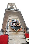
This one inhabits a corner, if we can grace it with that name (a spike would be more appropriate), on one of my favourite crossroads, the Carrefour de Buci, in between the Latin Quarter and St. Germain des Prés. This is its story...
Key points
Curiosity value
It's a weird building,
and although that can't carry the photo in itself, it's a
good starting point. How many pics have you seen where the
subject either doesn't exist or is primordially boring? A
lot.
Composition
What is vital with something like this is not to lose the
reason it's interesting in the first place. A badly composed
shot stemming from a poorly chosen vantage point can
completely negate what you can see with the naked eye.
Don't forget when you
take the shot that your eyes don't have four little lines
called the frame chopping everything else out of the
picture. Which is why you sometimes see people holding their
hands up in a little rectangular shape and looking through
them. It can seem a bit precious but has a real practical
use.
The easiest way of
emphasising something long and thin is to make sure you use
a portrait composition, not landscape, and you can even make
it narrower later if you want to increase this effect.
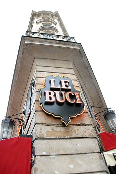 Finally,
keep an eye open for complementary effects or elements.
Here, there are balancing bits of red from the awnings on
both sides which stabilise the image. These are crowned by
identical lamps which also add interest. Finally,
keep an eye open for complementary effects or elements.
Here, there are balancing bits of red from the awnings on
both sides which stabilise the image. These are crowned by
identical lamps which also add interest.
I could have tried to
make the shot perfectly symmetrical: almost a mirror image
if you drew a line down the middle from top to bottom (apart
from the words, of course). But this only works sometimes,
and can seem a little artificial, so I went for the slightly
off-keel angle.
Post
processing
The
shot was pretty dull, so I bumped everything up a bit,
which has added some texture to the wall in the form of
the peeling paint or erosion in particular. The sky is
mind-blowingly boring, but never mind - a stunning
deeply saturated blue backdrop with puffy white clouds
added later just wouldn't have been honest. In the end
this is just a simple shot of a typically curious
Parisian building and nothing more. But taken straight
on, rather than grovelling around on the ground on my
knees it would have been much less.
Photo Ideas
Then comment on this
lesson with a link to your best result - we all want to see
them!
Summary
~ Comment on this lesson in the Photo Blog ~
This lesson belongs to the following sections... ~ under development ~ |